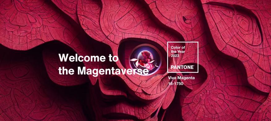
Viva Magenta is brave and fearless, and a pulsating color whose exuberance promotes a joyous and optimistic celebration, writing a new narrative.
It is a new animated red that revels in pure joy, encouraging experimentation and self-expression without restraint, an electrifying, and a boundaryless shade that is manifesting as a stand-out statement. PANTONE 18-1750 Viva Magenta welcomes anyone and everyone with the same verve for life and rebellious spirit. It is a color that is audacious, full of wit and inclusive of all.

First impression of the 2023 Pantone Color of the Year? Split decision, depending on the rendering of the color.
I first looked at the color on a laptop screen and it wasn’t my favorite. The name “Viva Magenta” was promising, but the laptop rendered a more muted version of the color that looked more like a dull, brick red to me. I felt like it was a very close relation to 2015’s color, Marsala (of which, I was not a fan).
A few hours later, I happened to look at the announcement again on my iPhone screen and this time, the expectation of what a shade called Viva Magenta should look like matched what I saw on my screen. I started checking other devices, and sure enough, the color appeared slightly different on each. The newer the device, the more vibrant the color appeared.
Seeing differences in how a color renders in print is common (and sometimes painful for those of us who are NOT print professionals, but who rely on color consistency in print materials), and that is an entirely separate topic. The difference in how Viva Magenta rendered on different screens was the first time I have noticed such dramatic differences digitally.
Pantone also released photos of Color of the Year collaborations, and I loved those as well as the product collections that various news agencies compiled of the color.
My final verdict? I do enjoy this color and like the mood that it evokes so it will absolutely be appearing in my events this year.

