Classic Blue: Calm, Reassuring, Thought-Provoking
Instilling calm, confidence, and connection …
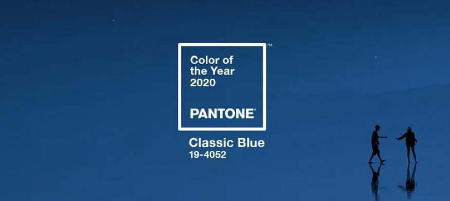
A timeless and enduring blue hue, PANTONE 19-4052 Classic Blue is elegant in its simplicity.
Suggestive of the sky at dusk, the reassuring qualities of the thought-provoking PANTONE 19-4052 Classic Blue highlight our desire for a dependable and stable foundation on which to build as we cross the threshold into a new era.

We've spent time reflecting on this color, and our first impression of the 2020 Pantone Color of the Year still holds true. We love it.
In general, we love all shades of blue and this particular shade is no different. It is stunning in it’s simplicity and it brings a sense of calmness. It is also extremely adaptable and full of possibility.
From an event perspective, we are excited to feature Classic Blue throughout 2020. CNN reported that PANTONE created a multi-sensory Classic Blue experience for the reveal event:
“The fragrance of Classic Blue wafted through the air while Classic Blue sounds resounded. Classic Blue-textured cushions littered the floor and Classic Blue drinks were served. It was, beyond dispute, a Classic Blue sight to behold. But interpreting the color through the other four senses is a far less objective task. The official Classic Blue scent is described in part as a "contemplation of where sky and sea meet;" the taste as "flowering vines;" the touch as a "soft velvety texture;" the sound as "vivid nostalgia."”
As event professionals, we LOVE that they incorporated the color into the entire event to make it a complete sensory experience for attendees. That type of experience isn’t feasible or practical for every event, but we look forward to using it as inspiration for those that are.
We know that not everyone loves the choice of Classic Blue for this year, but it isn’t uncommon for creatives to be split on the color of the year. We were not a fan of Marsala back in 2015, and we made it known. And yes, we have worked our lack of enthusiasm about Marsala into all color of the year posts since then. We understand the feeling some have described as “underwhelmed” about Classic Blue and that it is a “safe and boring” choice. But safe choices are OK sometimes, and in a chaotic world, “safe” can be enticing and bold. It can also be calm and serene. Classic Blue is versatile and can mean whatever you want it to mean in the moment.
As Pantone says, it provides a “stable foundation” and we are all for a stable foundation as we begin this new decade that is full of yet-to-be-known events, innovations, and milestones. At this moment in 2010, we had never heard of an iPad and Netflix was still a DVD-by-mail rental company. Can we even begin to imagine what the world will look like 10 years from now? As we embark on this new decade, starting off with a classic (a “stable foundation”) seems appropriate.
As a footnote, the first PANTONE Color of the Year was Cerulean in 2000. In honor of the 20th anniversary of Cerulean, we leave you with one of our favorite movie scenes:
Your Turn!
Thoughts on Classic Blue? Share on Linkedin.

